
Data Visualization
Various graphs, charts, and maps were created to obtain alternative views of our data and develop initial insights around some of our research questions. These visuals, along with a brief analysis for each, can be seen below.
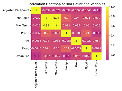
Visualization #1: Correlation Heatmap
The correlation heatmap shows the strength and direction of relationship between the numerical values enumerated along the x and y axis.
Based on the heatmap to the right, we can see there are no very strong relationships between any of the features and the Adjusted Bird Count, which is our predicted variable. The strongest relationship is the Urban Population variable which is a number between 1 and 5 that indicates how urban a county is. We can also see that the Min Temp and Max Temp variables are very highly correlated, which indicates we should not use both in our model but instead choose one or use an average monthly temperature value instead.
1
Visualizations #2 and #3: Bird Count and Adjusted Bird Count by Urban Population Level
The bar chart to the left shows the bird count (in 100-thousands) by urban population level.
This chart shows a high number of birds in the category 5 counties, which are the most heavily populated counties. This indicates that the counts may be high in those areas because there are more people counting birds rather than because there are actually more birds present, which was a bias we anticipated. To account for this bias, we created a variable "bird_count_adjusted_for_population" which divides the bird count by population.
The visual on the right shows these adjusted bird counts which display a pattern closer to what we would expect: a higher presence of birds in more rural areas.


Visualization #4: Adjusted Bird Count and Temperature by County
This visualization shows the Adjusted Bird Count and Min and Max Temperatures by County. From it, we can gauge 1) which counties have higher bird counts after being adjusted for population, 2) the relationship between temperature and adjusted bird count.
This graph corroborates the lack of relationship between temperature and adjusted bird count that was presented in the correlation heat map.
1

Visualization #5: Relationship between Adjusted Bird Count and Weather Variables
The pair plot below shows the relationships (or rather lack thereof) between minimum temperature, maximum temperature, and precipitation with the adjusted bird counts. The red lines are the regression lines, which show little to know relationship between any of the weather variables and the adjusted bird counts.

Visualization #6: Adjusted Bird Count and Temperature by County
This visualization is a different view of the Adjusted Bird Count plotted against the Average Maximum Temperature with the points colored based on bird family. The intention was to see if there was any pattern within the coloration of the points (ie, clusters of colors, vertical stripes of colors) which could indicate that a relationship exists between the temperature and the prevalence of different bird species, however this does not appear to be the case.
1

Visualization #7: Overall Bird Count by Month
This visual shows the change in overall Bird Count over time. We can see from this chart that, over the past few years, the exodus of birds during the warmer months was a month earlier last year than the prior years and that the peak presence of birds in the winter has become slightly earlier over the past few years. In 2021 and 2022, and 2023 it was around December, 2024 was around February, and 2025 was around January. Though none of these trends are particularly long, they are definitely worth exploring.

Visualization #8: Adjusted Bird Count by Season
The visualization to the left shows the average Adjusted Bird Counts by county for each of the four seasons. There are not many insights that can be obtained from this visual as different bird families prefer different climate conditions and will therefore be more prevalent during different seasons. As such, the lack of one family of birds in one season will also be the peak season to spot a different family and the net effect to the bird count may be limited. However we do clearly see that the northern county of Jackson has more birds in the warmer seasons (Spring and Summer) than the others. Whereas the eastern counties of Kit Carson and Cheyenne are more heavily populated by birds in the colder seasons (Autumn and Winter).
1

Visualization #11: Bottom 10 Bird Species by Count
The bar chart below shows the bottom 10 bird species/families by Bird Count, which is the non-population adjusted bird count. This shows the prevalence of the least commonly spotted families of birds in Colorado. We can then use this information to our research question pertaining to which bird species appear to be threatened / are at risk of becoming endangered.

Visualization #12: Bottom 10 Bird Species Count Over Time
The line graph below supplements the previous visualization to answer our research question: which bird species appear to be threatened / are at risk of becoming endangered? We can see that of the bottom 10 bird families, Guineafowl sightings in Colorado appear to be slowly declining. Storks and Limpkin had very sparse sightings, but experienced a decline when sighted. With the bottom 10 families, one bias that may exist is that people are less familiar with these families of birds and either mis-classify spotted birds or do not classify these birds at all when spotted if bird enthusiasts are unsure of the family to which they belong.

Visualization #9: Top 10 Bird Species by Count
The bar chart below shows the top 10 bird species/families by Bird Count, which is the non-population adjusted bird count. This shows the prevalence of the most commonly spotted families of birds in Colorado. We can then use this information to focus our analysis of trends and/or relationships. Given that there are around 65 different families of birds represented in the data, we can narrow our visualizations to represent the top 10 families of birds to make them more easily readable and answer our research questions about the migration patterns of birds.

Visualization #10: Ducks, Geese and Waterfowl Count by Month
The visualization below explores the change in Bird Count over time for the most spotted family of birds in Colorado: Ducks, Gees, and Waterfowl. We can see that though migration patterns have stayed largely consistent, there do appear to be decreases in bird counts from year-to-year in April, May and June which possibly indicates that perhaps migration is occurring earlier due to climate change.

Visualization #13: Fire Counts by County
The bar chart below shows the Number of Fires for the 5 counties that experienced fires during the time period in scope for our analysis (2021-2025). While the correlation heatmap indicated that there was little/no relationship between is_fire and adjusted bird count, we can clearly see this lack of relationship by identifying the position of the 5 counties with fires in visualization $4. The counties are sorted in descending order by Adjusted Bird Count in visualization $4 and these 5 counties are not at the beginning or end of the x-axis, but rather in no particular pattern.
1

Visualization #14: Monthly Max Temperature by County, by Year
This box plot shows the distribution of monthly maximum temperatures for each Colorado county, grouped by year. While the temperature ranges are mostly consistent across the five-year period, there is a slight upward shift in the interquartile range across the years, which reflects global climate change.

Visualization #15: Monthly Total Precipitation by County, by Year
This boxplot shows the distribution of monthly total precipitation for each Colorado county, grouped by year. The median monthly total precipitation increases slightly from 2021 to 2023, then decreases from 2023 to 2025. It is also notable that the interquartile range has decreased overall from 2021 to 2025.

Visualization #16: Quantile-Quantile (QQ) Plot of Bird Count in 2021 vs. 2025
This quantile-quantile plot of monthly Bird Counts for each Colorado county for 2021 against counts in 2025 shows a shift in the distribution of monthly bird counts going from 2025 to 2021, which means that generally speaking, the observed monthly bird counts are higher in 2021 than in 2025. The difference becomes more pronounced at higher counts.
Note: The maximum for Bird Count does not reach as high as in other visualizations because outliers (observations of more than 400 birds) were trimmed from the dataset for purposes of this plot)

1 As seen in Visualization 2, the bar chart of Bird Count vs. Urban Population Level shows a high number of birds in the category 5 counties, which are the most heavily populated counties. This indicates that the counts may be high in those areas because there are more people counting birds rather than because there are actually more birds present, which was a bias we anticipated. To account for this bias, we created a variable "bird_count_adjusted_for_population" (reffered to throughout as Adjusted Bird Count) which divides the bird count by population.